Designer Q&A: Shalini Misra
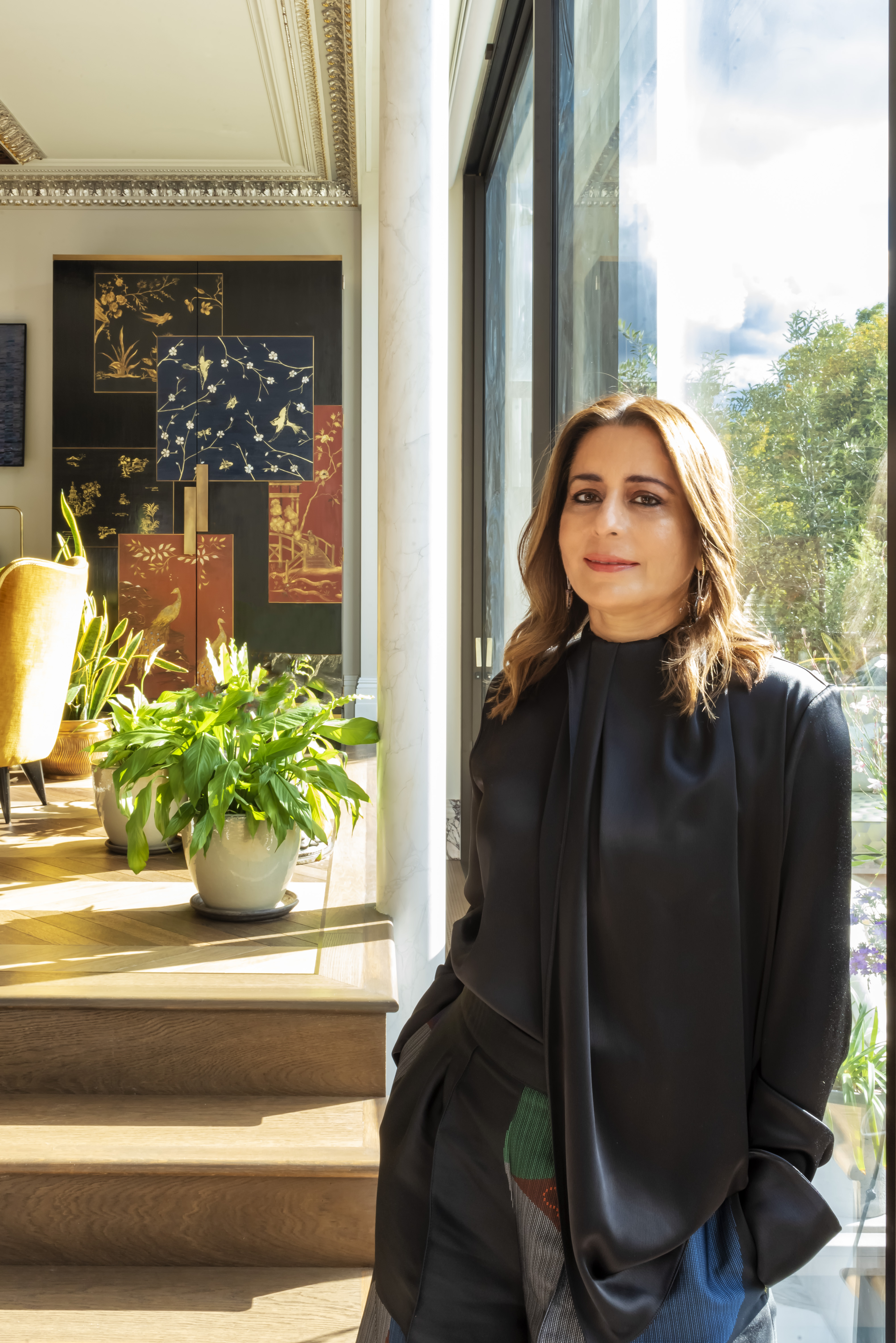
The work of interior designer Shalini Misra is renowned around the world. She tells us about her career path and design philosophy as well as showing us around her own home.
Shalini Misra founded her architectural and luxury interior design studio in 1996. Her company has created multi award-winning interior design projects around the world, and its range of work includes prime residential homes and developments, high-end offices, boutique hotels, restaurants and exhibition spaces.
Shalini qualified as an architect at the School of Planning and Architecture, Delhi (SPA) in India, and specialised in urban planning at Columbia University in New York before studying virtual reality in architecture at the Bartlett School of Architecture, UCL.
She is also a trustee and mentor of UK charity Vahani Scholarship Trust, a non-profit organisation that recognises the importance of opening doors for underprivileged children.
We asked her to tell us about her inspirations and future plans, and to give us an insight into the design of her own home.
What inspired you to become a designer?
Put simply, from an early age, I have always been fascinated by the power and potential that every space has to be transformed into something that can be inspiring for its qualities of energy and light. Spaces to live and thrive in, which reflect our own needs as human beings – places in which we can rest, thrive, re-energise and from where we can launch ourselves into the world and take on the multiple challenges it throws at us.
I think this underlying view of the world in which I lived led me to train as an architect and urban planner and to study virtual reality at UCL and from there, I simply wanted to become an interior designer.
Can you tell us a little about your design ethos?
Well, my design ethos follows on from my inspiration to be a designer in the first place. Designing spaces is something that you do for people and is about understanding their view on the world they want to live in and meshing it together with your own learnings and inspirations.
Ultimately, the space that you are creating is for someone to love, to be inspired by – quite literally a launch pad from which they go on to live their lives in the outside world. That space must be imbued with a sense of wellbeing that resonates with that person’s spirit. So I try to put designs together for people that feature sustainable materials, timeless elegance and enduring versatility so they have the potential to last for many years rather than just a few seasons.
What does membership of the BIID bring you?
I value the BIID for the community and connections it offers, the integrity that it embodies for professionalism in my field and for the credibility that its institutional membership provides to the market.
Are you able to share any future plans for your practice?
2020 has been a deeply challenging year on many levels and so many practices have needed to consider their position in the market very carefully. It’s a year that has emphasised the importance of wellbeing and sustainability on a personal, corporate and global level. So, our future plans are to stand firm behind the ethos we have developed over the last two decades by offering our clients a holistic approach to designing spaces which are developed for their own wellbeing and lifestyle needs and championing the craftspeople and designers we work with to bring incredible interior designs and items into their homes.
We have launched an online interiors shop called The Design Buzz which is a celebration of the companies and characters we have worked with over the years in this industry.
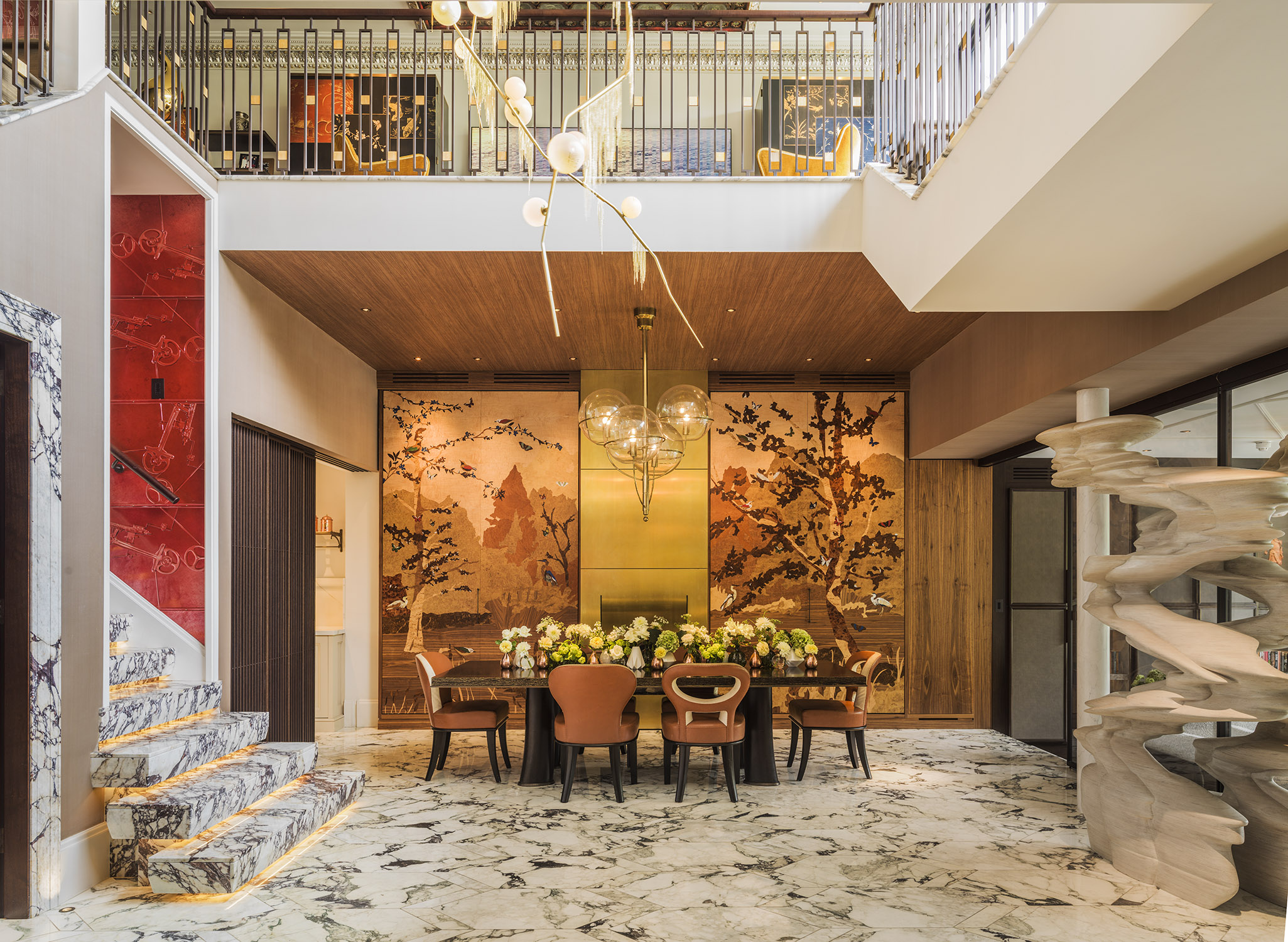
Please take us on a tour of your own London home. The dining area has custom designed marble flooring and features a vintage chandelier. Can you talk to us about your choice of these elements?
I wanted to collect special pieces of furniture I could pass on to my children so each vintage piece in the house has a lot of meaning.
We have combined rich marbles in bespoke patterns with silk wallpapers and reupholstered vintage furniture throughout the house.
The dining area also has marquetry panelling on sliding doors which hide all our daily kitchen clutter and crockery.
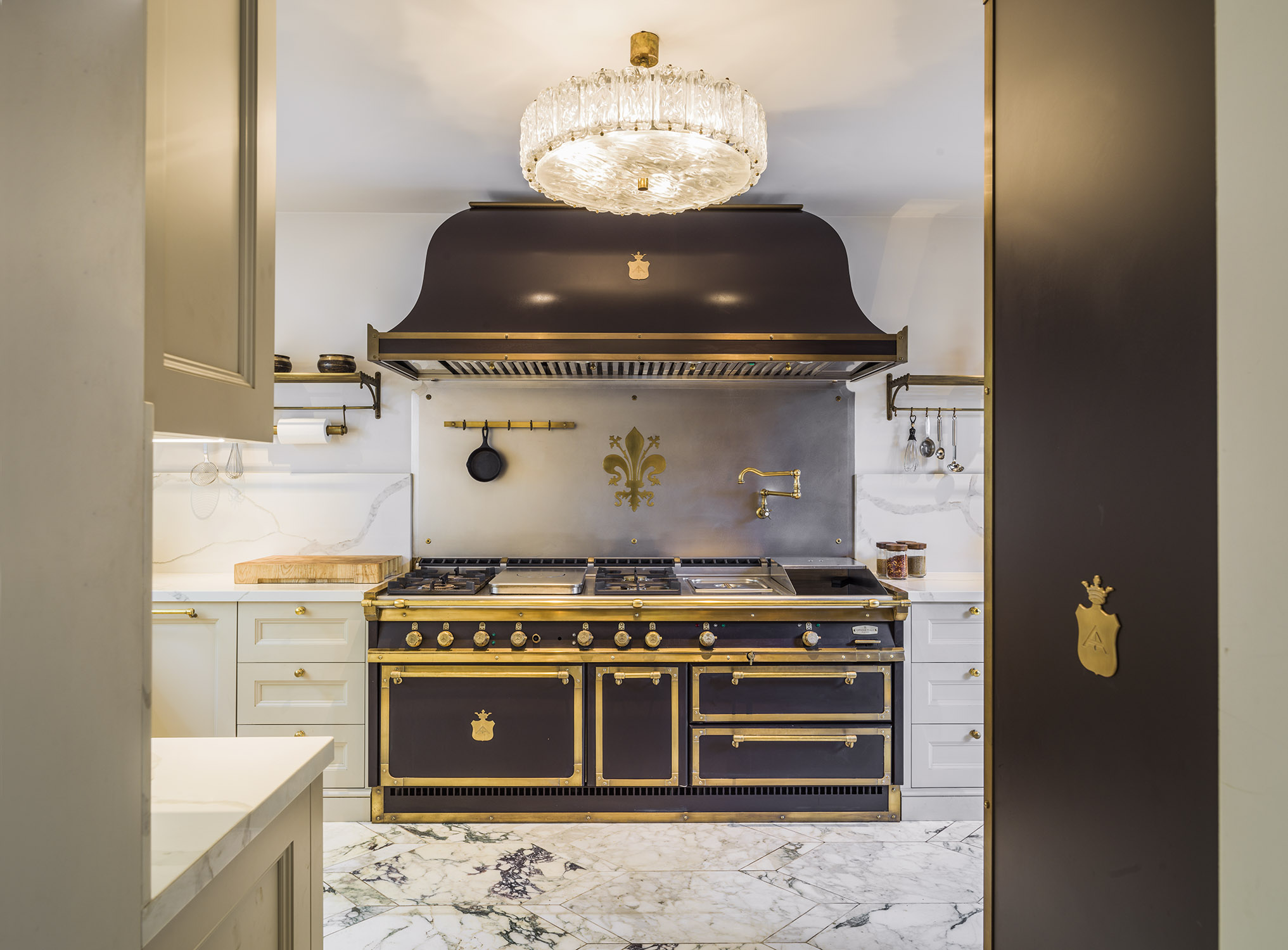
The range is a fabulous centrepiece to the elegant kitchen. What were the needs you realised in designing this room?
The lower ground floor is really the heart of our house and where, as a family, we spend the most amount of time. We love to eat and entertain and the kitchen is a space in which we all find ourselves for various purposes.
At bigger events we close off the kitchen with the sliding doors but on a regular basis we love the open-plan feel.
The range is by Officine Gullo; I love the Italian feel of their kitchens and accessories especially the beautifully crafted Florentine metalwork.
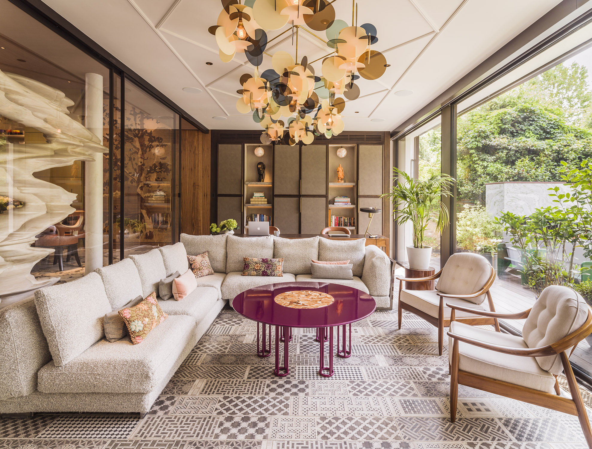
This seating area is rich in decorative interest – and wonderfully relaxing. Can you tell us about the space?
This is a room we use for everything – from after-meal lounging to Zoom calls for work and sometimes even a relaxing movie. We love the view of the garden and often play bridge or Scrabble here.
I love the graphic patterned timber floor from Fornasetti, a bespoke commissioned chandelier which is a collection of coloured acrylic discs suspended from the ceiling and the pop of colour in the coffee table, both from the Nilufar Gallery.
I also wanted to have storage solutions in every space because we all tend to live with so much clutter and this way it just gets hidden away!
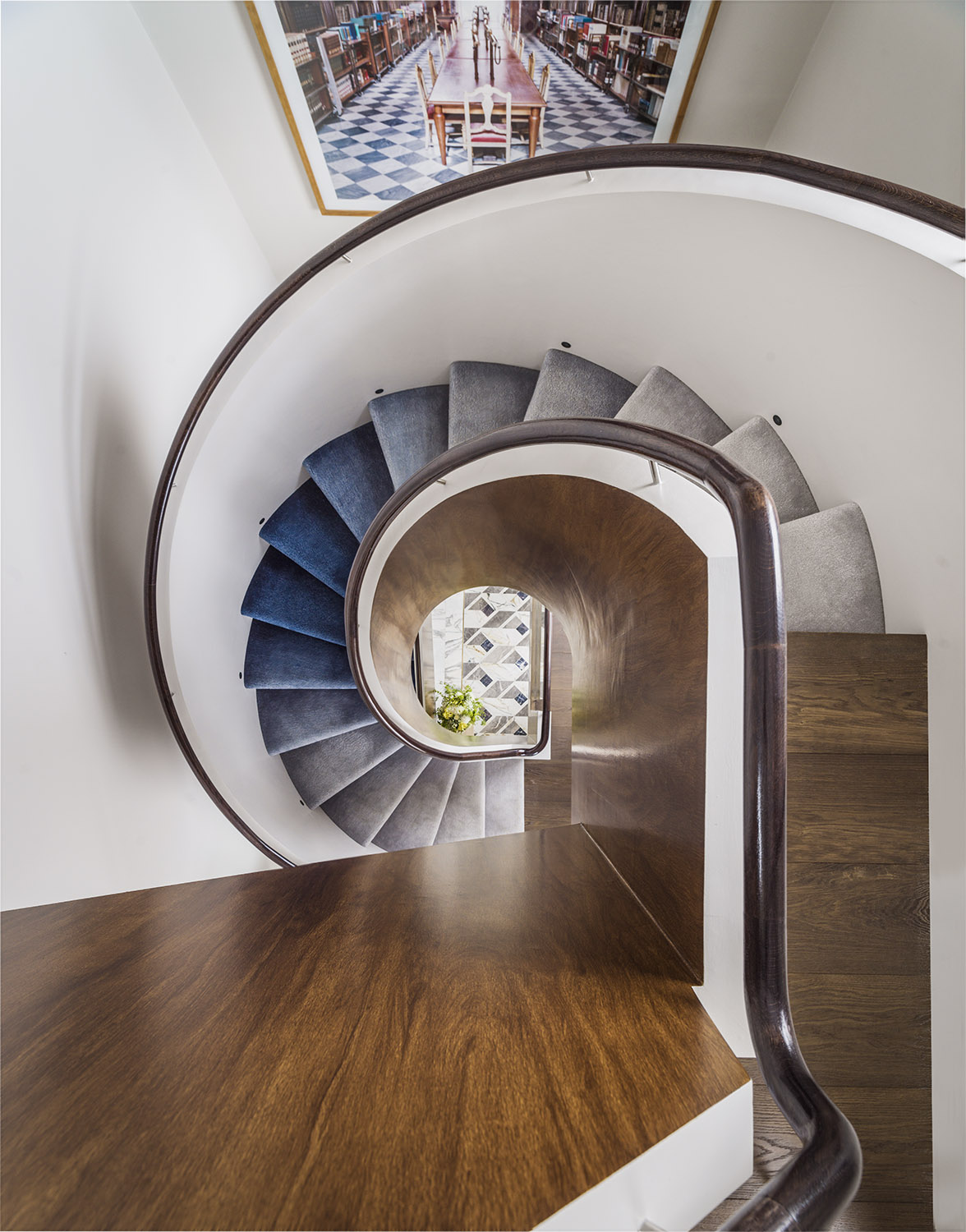
How did you make the staircase into a striking feature of the house?
I have lived in this home for over 20 years – the first time we refurbished the house I was fresh out of architecture school and more of a purist at heart when it came to designing. We repositioned the staircase in the house and painted the balustrade.
This time I wanted to keep the staircase structure but add some layered features to the design. I was keen to have the balustrade in a timber finish but due to the shape and structure of the staircase this was proving much harder than anticipated.
Through extensive research my team and I were able to find artists who could paint the balustrade to look exactly like timber, so we had a huge scaffolding erected and over the course of several days these artists transformed the balustrade to replicate oak timber.
We worked with the Rug Company and commissioned an ombre staircase runner. The artwork is one of my favourites, a large scale photograph of a library in Florence by Candida Hofer.
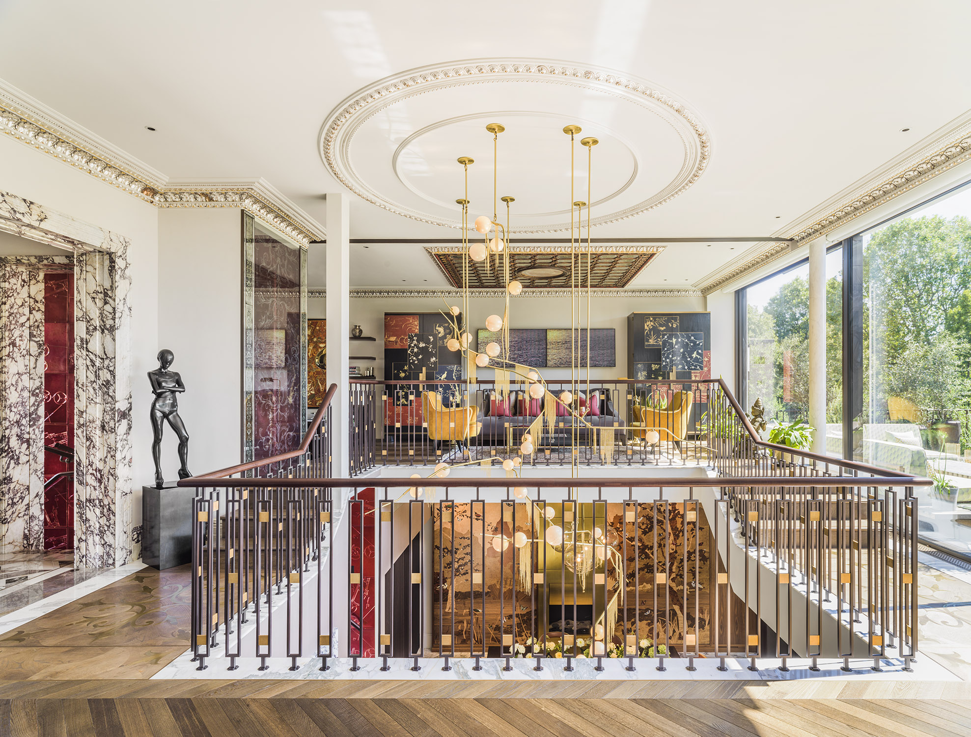
Can you tell us something about the colour palette you chose for your home?
The one thing all my family members and I were in agreement on regarding the design was the use of colour! We all wanted to use as much colour as possible throughout the house and create a layered vibrant palette. We used pared-back tones for walls and floors and added pops of colour in furniture pieces and through upholstery and art.
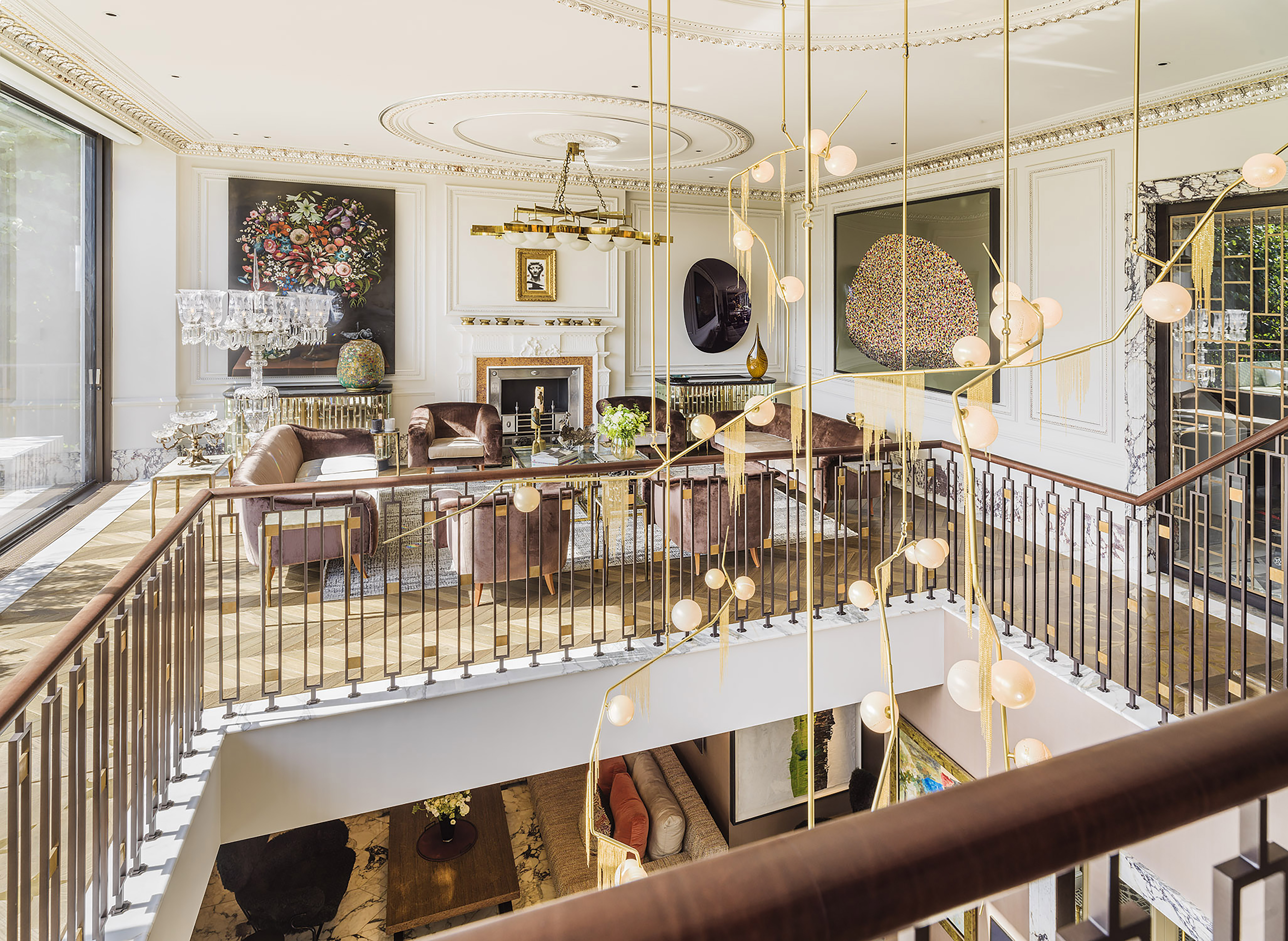 And art plays a major part in your interiors. Could you talk to us about your choices here?
My family and I love art – I have been an avid collector for a few years and like to build up my collections by visiting different art fairs and galleries across the world. Art has always been an important focus of my work and my home and I believe that most importantly art should breathe life and personality into a space.
The Anish Kapoor speaks for itself and is a striking piece and we love the bit of drama it adds to the space.
The large piece on the right is by a contemporary Indian artist, Bharti Kher, whose work I have admired for years.
The painting by Ged Quinn just lifts my spirits on a rainy day and is one I love to gaze at as each time I discover new elements within it.
One of our recent acquisitions is the work by Italian artist Francesco Vezzoli placed above the fireplace which is hauntingly beautiful and I love the embroidery work.
Take a look at our designer Q&As with Sophie Ashby, Sue Timney, Staffan Tollgård, Jenny Weiss and Helen Bygraves and Kelly Hoppen.
Meet your local ambassador and help grow your community
Explore new resources from the BIID. Seeing a padlock? Just login or become a member to view.
Angela Bardino reflects on a landmark year for the BIID
The BIID Student Drawing Competition has now launched for 2025
Celebrate 60 years of the BIID with Past Presidents Gordon Lindsay and Christopher Vane Percy
Explore new resources from the BIID. Seeing a padlock? Just login or become a member to view.


