Designer Q&A: Jenny Weiss and Helen Bygraves
Co-founders of award-winning Hill House Interiors Jenny Weiss and Helen Bygraves tell us about their design philosophy and introduce one of their prestigious projects
Hill House Interiors, co-founded by Jenny Weiss and Helen Bygraves over 20 years ago, is a multi award-winning practice recognised for its luxury interior designs both in the UK and around the world. Their portfolio of projects includes prime central London penthouses, home counties mansions, Mediterranean villas, heritage buildings and Oyster yachts.
We talked to Jenny and Helen about what inspired them to become designers, and their future plans, and they gave us an insight into one of their projects: a luxury duplex apartment at NEO Bankside on London’s South Bank.
What inspired each of you to become a designer?
Jenny: From a young age, I’d been top in art and loved drawing and painting, and getting inspiration from all sorts of places, particularly nature. Creativity is in my DNA.
Helen: Essentially, it was a love of beautiful interiors. I’d done quite a few renovations and was told I should consider it as a living.
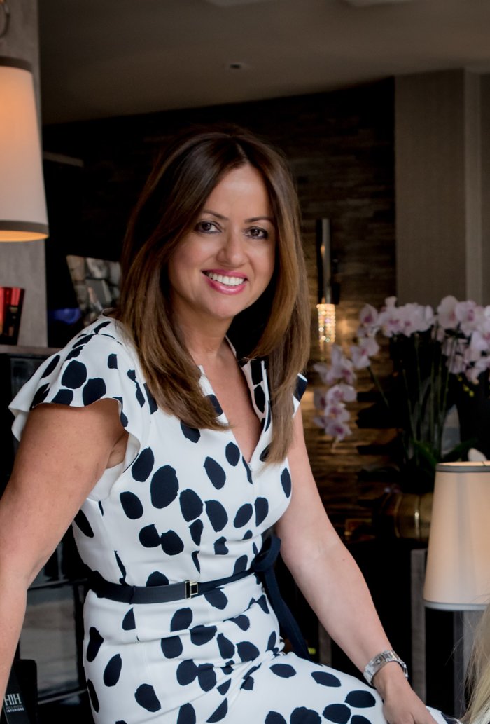
Jenny and Helen answered questions together and below is a combination of their responses.
What’s your design philosophy?
A client’s home needs to reflect them and their personality. People come to us for our portfolio but equally we tailor-make for our clients – we’re conscious of giving them what they want, although obviously we try to guide them. We’re also known for our attention to detail.
Lots of our clients remain close friends after projects. Design is about a relationship, and our returning clients are a testament to that. The ethos we pass on to young designers is to have rapport with clients – you come into people’s lives and are a big part of them.
What does membership of the BIID mean to you?
It’s huge. It’s great to have a recognised body and to have guidelines in the industry. It’s reassuring for clients, and gives you more professionalism. There’s a sense of community and you’re linked to other designers and get to meet others from the industry.
Can you share any future plans for your practice?
We’re already a team of 22 and we like the number we’ve achieved. The bigger you get, the more diluted you can become. We have a lifestyle showroom as well as the main design office so even if you can’t afford our interior design, you can buy into how to get the look. We encourage other designers to buy from our showroom, and we offer them a discount.
Maintaining high standards is always up there. We’re always updating our social media and how we present with PR an ever-evolving part of the business. In terms of practice, it’s keeping up to date with industry standards, courses, CPD. Every Wednesday we have at least six companies come in to do a presentation.
We’re also going to start running masterclasses and invite people in to learn tips and techniques.
What advice would you give to young and new designers starting out?
Be prepared to work hard. People think interior design is fluffy and it isn’t. We always say architectural and space planning skills are a great place to start. We do advise people to do courses, but the real learning curve is when you’re in the job itself and a lot of juniors learn quickly when they start working with a senior designer.
Take time to go to exhibitions, for example, Decorex, Surface and Milan, to get inspiration and see prototypes. We still walk the halls seeing any new artisan. We note how many people go to shows and it’s not as many as you’d think it would be. We believe it’s a big part of what we do.
What adaptations have you made with social distancing rules in place as we talk?
It’s crucial to say that we’ve worked like this for several years with overseas clients; Zoom and other platforms are proving very successful. We’ve been DHLing moodboards across the world.
We’re still reacting to new enquiries and working on current projects. Social media is a selling platform for us and we’re getting enquiries while people are spending so much time in their own homes, and thinking about redundant rooms that could be put to better use.
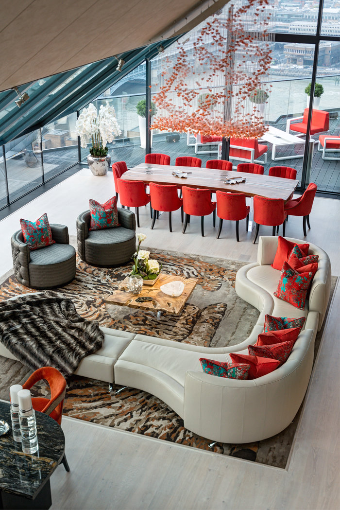
Can you tell us about this stunning apartment at NEO Bankside in London?
The building is a landmark on the South Bank, and the apartment is a quite astonishing duplex of 5000 square feet. The spaces are great, and it has the most amazing 360º views of London. The client had been looking for a number of years for a penthouse that wowed and then he found this and one in New York at the same time, and we did both. It’s a family apartment with five suites and not just a bachelor pad.
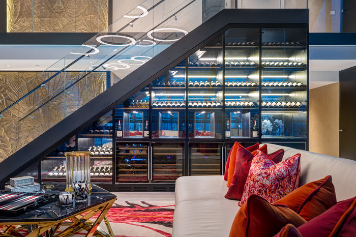
How did you approach the dramatic space?
The client was led by Hill House, and our space planning designs. It’s a vast space and we had to zone it with two areas for seating, one more formal. We came up with wine storage under the staircase. He had a vast wine selection and we had to use special film to ensure the sunlight didn’t change the quality of the wine.
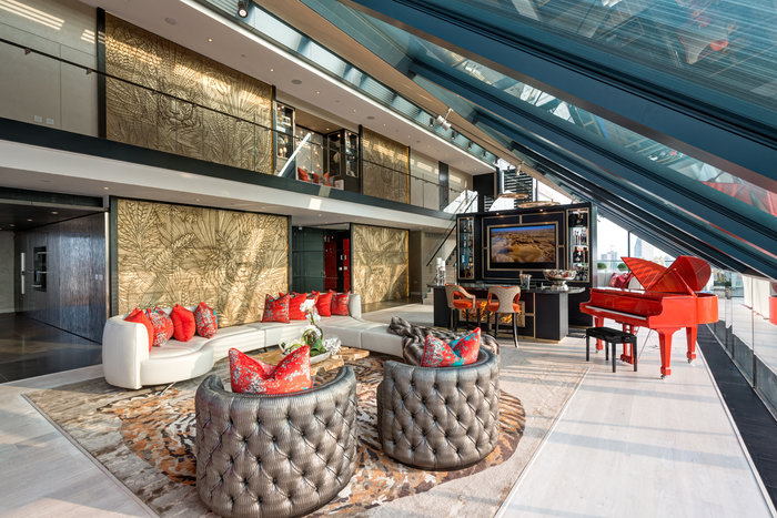
Where did the colour palette come from?
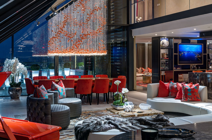
The starting point was a Ferrari red piano. The client loves reds and oranges but we had to ensure we didn’t overkill on them so we brought in bronze tones. He wanted elements of red in the bedroom, but we used it with cream and lighter tones like soft gold.
The tiger wall panels are spectacular. Can you talk about them?
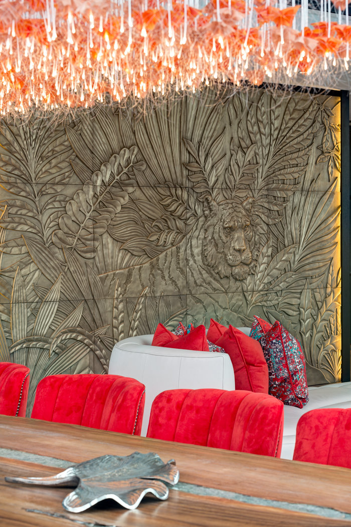
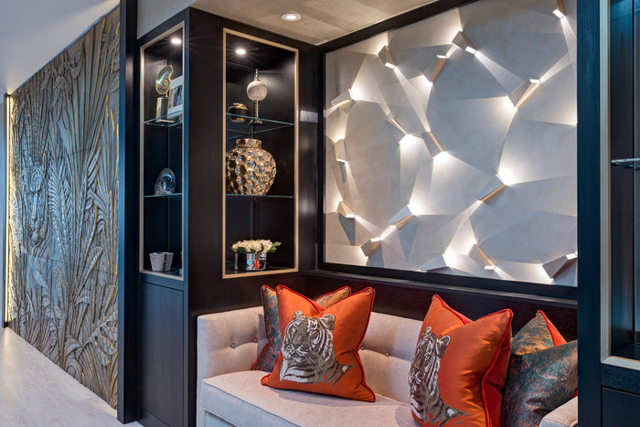
We had seen them on one of our trips to Milan and we came up with the concept of two sections that went through the two heights. We created panels out of bronze and had suggested elephants but he said could we use tigers instead? Each has a different tiger’s head and they were hand-carved in Moscow in large sections that were put together on site.
Can you talk a little about the lighting?
The lighting is a big part of the design. The property was designed 10 years before and it had been on the market for a couple of years, so we had to update the lighting and create a new design. The central chandelier is fibre optic. The architectural lighting on the first floor above the built-in banquette looks really dramatic and the light creates amazing shadows that make it look 3D. The pots on the terrace also light up.
You made changes to the apartment’s kitchen…
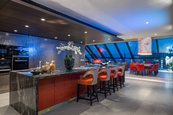
The kitchen was very industrial and we needed to bring in more luxurious elements. It had dark brown units and a dark brown ceiling and we added a red leather underneath the counter, and took all the doors away and had them finished in liquid metal. We used cosmic black marble on the island. The client loves cooking so we introduced a Zip tap and a larger hob and some teppanyaki.
Take a look at our designer Q&As with Sophie Ashby, Sue Timney and Staffan Tollgård
Meet your local ambassador and help grow your community
Explore new resources from the BIID. Seeing a padlock? Just login or become a member to view.
Angela Bardino reflects on a landmark year for the BIID
The BIID Student Drawing Competition has now launched for 2025
Celebrate 60 years of the BIID with Past Presidents Gordon Lindsay and Christopher Vane Percy
Explore new resources from the BIID. Seeing a padlock? Just login or become a member to view.
