Designer Q&A: Christopher Dezille
Designer Christopher Dezille creates strong, sustainable and timeless interiors. Here he shares his career journey, design ethos and shows us around a London project.
Christopher Dezille founded multidisciplinary architectural and interior design practice Honky Design in 2001. London-based Honky works with both property developers and private clients in some of the capital’s most exclusive areas and overseas projects have been completed in locations including the Channel Islands, Cannes, Montenegro and the Bahamas.
Recognised for his sharp visual awareness and attention to detail, Chris sees interior design as storytelling in 3D. We asked him to tell us about his start in the profession, his design vision, and to give us an insight into a project in London’s Albert Embankment Plaza on the South Bank.
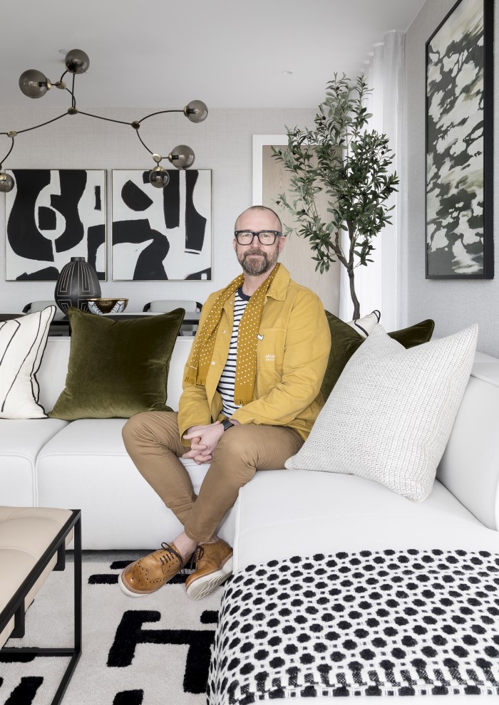
What inspired you to become an interior designer?
With a love of drawing, it was clear from a young age that I was destined to end up in a creative industry. My route to interior design was somewhat circuitous but the progression from visual merchandiser felt entirely natural. My experience designing for these imaginary audiences involved a lot of technical and practical work, including building room sets and learning how to make a design work, not just create a pretty picture; everything had to be viable and functional. My love of working with three-dimensional design and understanding how design worked was the perfect entry into the world of interior design.
Can you tell us a little about your design ethos?
We design tailored, considered interiors with intelligent and inspiring schemes. We take a personal and practical approach to our clients, delivering commercially sensitive projects on time and on budget. Clients come to Honky not for a Honky look but a Honky finish.
You’re a member of the BIID. What does your membership bring you?
Having been a member of the BIID for well over a decade, I have found its support and information very valuable in running my business. We take advantage of the CPDs to ensure our team is up to date with the most accurate industry knowledge. The list of partners allows us to source suppliers for our projects that are already tried and tested, taking away the pressure that is involved when working with someone new.
Their parties are also legendary, a place for the interiors industry to celebrate its wealth of knowledge and creativity.
Are you able to share any future plans for your practice?
We have just moved to a new location in Clapham where my team and I work on a range of projects for private clients and developers. Our current projects include multiple apartments for a later living clientele, a six bedroom period house in Hampstead, a riverside country club, and a bijoux apartment for a Lady. The range of these interior design projects is testimony to the diversity of our team and our ability to interpret any brief no matter the client.
Can you tell us a little about this duplex apartment project on London’s South Bank. What was the brief from the client, and what was your approach?
The client for our project at Albert Embankment found us via the BIID website. Because the client was based in South America, the complete project was done remotely by email and Zoom, and all during the chaos of the pandemic.
The brief was to create a fresh and contemporary scheme using a natural colour palette with dark woods and textured elements but ensuring the apartment remained light filled and airy. For us, the view was the centrepiece in this duplex apartment, so our job was to make sure the interiors embraced and enhanced it. As the client was abroad, we specified everything from the window treatments to the bespoke furniture and artwork. Our stylists worked on every detail even down to specifying the candles and diffusers.

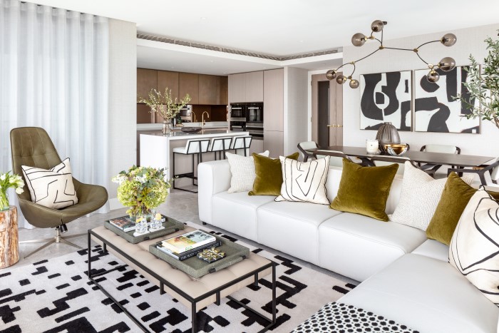

Could you talk to us about the colour palette in the apartment, including the beautiful green accents?
We kept things cool and contemporary with crisp whites and graphic monochrome, but paired this with teak, leather, and other natural, earthy touches to soften the edges. Splashes of rich greens including olive, evergreen and sage were diluted with a softer palette of sand, taupes and whites adding to the sophisticated palette. It's a calm, classic and beautiful space full of warmth and texture.
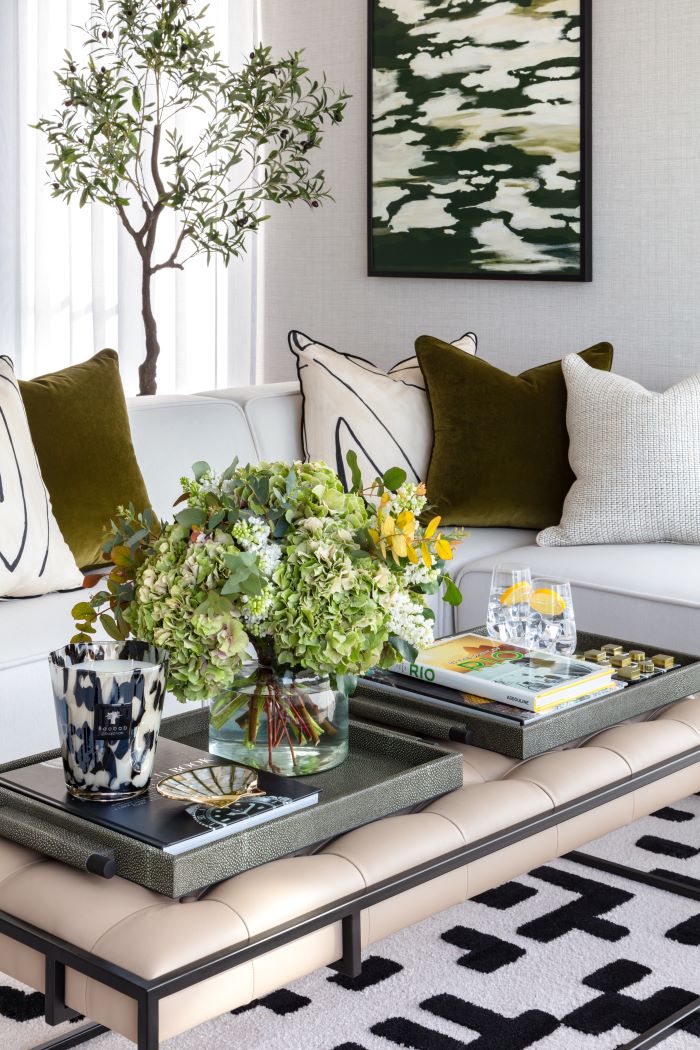
There are some wonderful textures in the apartment. What materials did you select and why?
A neutral scheme made the space feel cosy and comforting, and we sought to integrate warm neutrals to bring further warmth and versatility into the apartment. For a pop of colour, green was used on the accent chair and artwork creating a relaxing and balanced design. The dark textured woods of the dining table and chairs create contrast and warmth to the cooler textures and colour of the stone floors. The bold graphic rug ties the whole scheme together.
We have every fabric house on our doorstep and we are fortunate to be so close to the Design Centre at Chelsea Harbour. Combinations of pattern from Kelly Wearstler and textures from Zimmer + Rohde paired with luxurious velvets from Romo were used to elevate and enhance the neutral colour scheme.
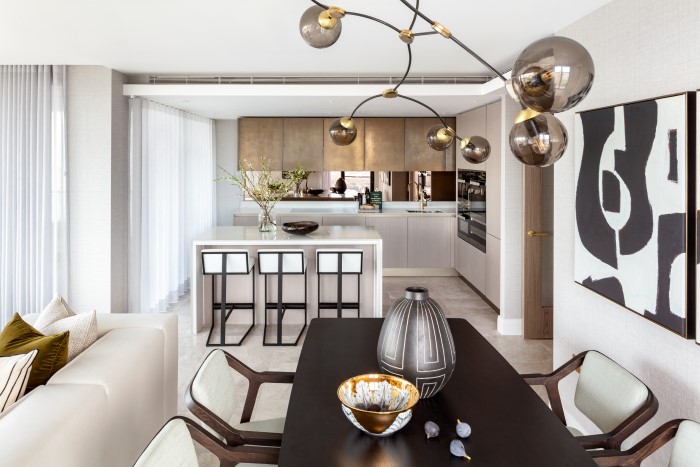
The kitchen combines finishes to great effect. What was important in its design?
The kitchen creates a perfect backdrop to our scheme. The shimmering bronzed wall cabinets and brass ironmongery were echoed in our dramatic light feature above the dining table in fume glass and brass. The stark white of the Corian island and graphic dark metal of the bar stools is a perfect pairing with the monochrome artwork and cushions. Mixing all these textures and finishes created a tailored and pared-back vision of the client’s eclectic brief.
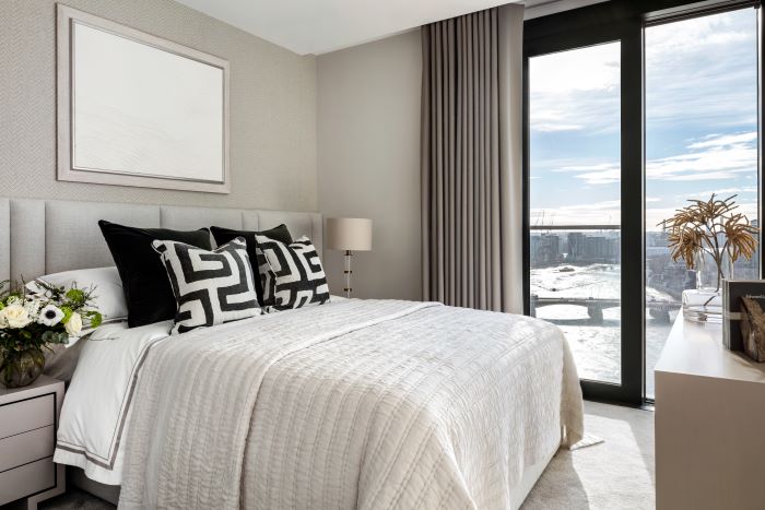
Like the rest of the apartment, this bedroom has an enviable view. How did this inform the interior design?
With the constantly changing London skyline and riverscape, this view was the protagonist in our bedroom scheme. We used neutral colours in all their variations using beige, ivory, taupe, black, grey, and shades of white, ensuring the view was uninterrupted and the room remained light filled and bright. Textured wallpapers and paints layered in different hues of the same natural colours created a warm, contemporary, and sophisticated feel. All bedrooms were designed to offer a peaceful sanctuary.
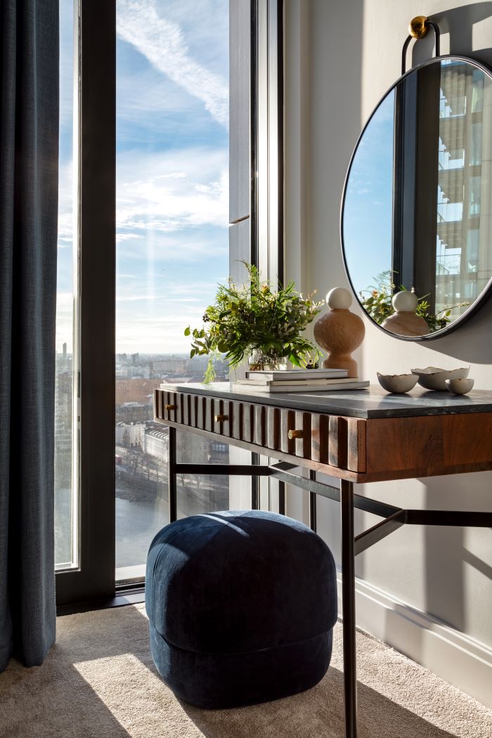
This table has appealing detail. Can you tell us about this and other furniture you selected for the project?
With London living, maximising space is always one of the paramount requirements. Thought and detail went into each piece of furniture to ensure it discreetly worked harder in both style and storage offering. Most of the furniture selected for this project was bespoke. Finishes were chosen that were reflected across multiple designs. Black metal detailing appeared across the whole apartment, mirroring the floor-to-ceiling windows. We repeated this detail on the legs of the console, the barstools and the bespoke coffee table, providing a cohesive design that flowed from room to room.
Natural materials like the stone on the dressing table, warm tactile woods and lush velvets added depth and texture. The result of these combined hues symbolised the balance and harmony of the natural world and reflected the outside in.
Take a look at our designer Q&As with Sophie Ashby, Sue Timney, Staffan Tollgård, Jenny Weiss and Helen Bygraves, Kelly Hoppen, Shalini Misra, Katharine Pooley and Brian Woulfe.
Meet your local ambassador and help grow your community
Explore new resources from the BIID. Seeing a padlock? Just login or become a member to view.
Angela Bardino reflects on a landmark year for the BIID
The BIID Student Drawing Competition has now launched for 2025
Celebrate 60 years of the BIID with Past Presidents Gordon Lindsay and Christopher Vane Percy
Explore new resources from the BIID. Seeing a padlock? Just login or become a member to view.


