Designer Q&A: Charu Gandhi
The founder and director of Elicyon, Charu Gandhi, talks to us about why the studio is a BIID Registered Design Practice, its 10th anniversary, and shares a recent project
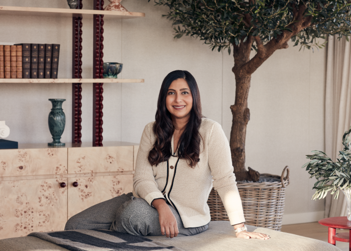
Charu Gandhi is the founder and director of Elicyon, a BIID Registered Design Practice. Elicyon is celebrating its 10th anniversary this year and since its beginning in 2014, the London-based luxury interior design studio has been involved in more than 90 projects in 15 countries, including the UK, Saudi Arabia, Monaco, India, China, the UAE and the USA.
Charu is a RIBA and ARB-qualified architect whose international upbringing and enquiring mind together with her professional training inform her approach to interior design. We asked her to talk to us about why Elicyon is a BIID Registered Design Practice and the importance of professionalism, the studio’s anniversary, and to show us round a private London apartment design the practice recently completed.
Congratulations on the 10th anniversary of Elicyon! How does it feel to be celebrating the practice’s first decade?
Thank you so much! Reaching 10 years is a real milestone. Reflecting on the past decade, I’m filled with a lot of gratitude. It has been a real journey, with each project offering the studio new and exciting opportunities to push our boundaries of creativity. This anniversary is a testament to the dedication of our team, to our clients' unwavering trust, and to the relationships we’ve built along the way. It’s a moment to celebrate, but also to look forward to the future.
What are the biggest changes you have seen in interior design over the past 10 years?
The past decade has seen a big evolution in interior design. One of the most significant changes has seen clients increasingly seeking personalised and meaningful spaces. Now more than ever, we are finding that our projects evidently reflect the identities and values of the people that live within them, in a move away from following trends.
We have also noticed a huge shift away from needless gadgets, with clients instead seeking a sleek, minimalist look when it comes to technology. The integration of technology has transformed our approach, from hidden task lighting systems to smart home solutions.
Sustainability has also become a key focus, with a growing emphasis on eco-friendly materials and practices.
Finally, I would say that the industry as a whole has become more inclusive and diverse, embracing a wider range of cultural influences and design philosophies.
Could you share any of your plans for Elicyon’s next decade?
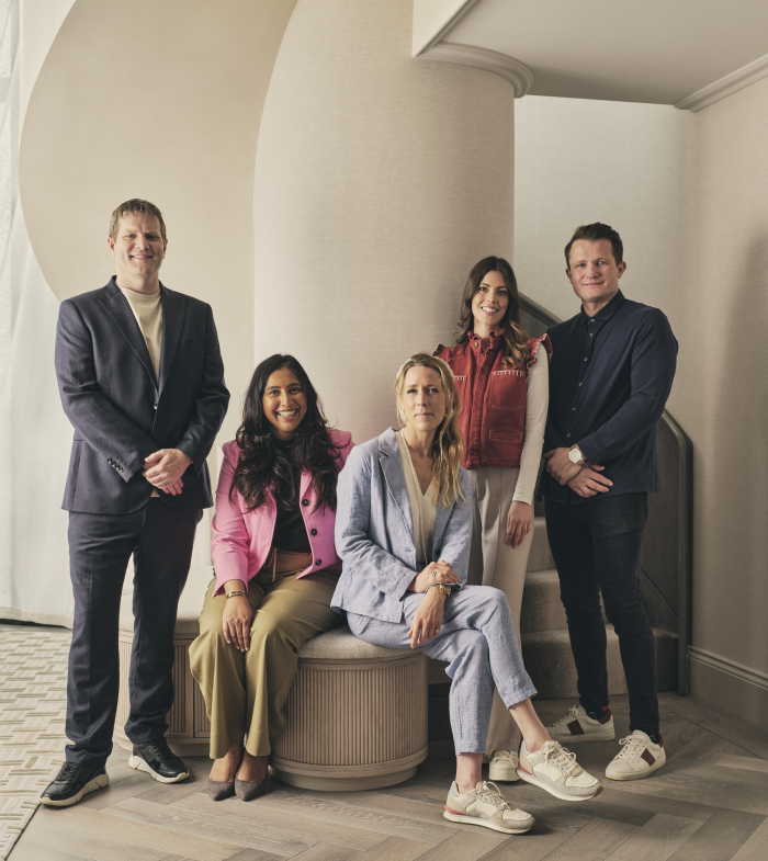
Looking ahead, our vision is one of continued innovation and growth. We are already working internationally and aim to continue on that global design journey, taking on more complex and significant projects that will challenge us creatively. We’re also excited to be working on our first commercial space in London’s Mayfair in the form of a luxury jewellery atelier. We hope this will be our first step towards more of these sorts of projects. Above all, we will continue to focus on our clients’ needs, ensuring that every project is a true reflection of their visions and aspirations.
Elicyon is a BIID Registered Design Practice. Could you tell us why you chose to affiliate with the BIID and why professionalism is so important to your practice?
Registering with the BIID was a natural choice for us as it aligns with our commitment to the highest standards of professionalism in interior design. The BIID represents excellence in the industry, and being a part of it underscores our dedication to ethical practices, continuous learning, and delivering exceptional service.
Your recent project in Regent’s Crescent in London is a private apartment. What was the brief from the client?
The brief for this project was to create a serene and sophisticated space that reflects the clients’ modern lifestyle whilst honouring the historical significance of the building. The clients, an international family, wanted a home away from home for their son who attends school in the UK. They wanted a sanctuary that balances comfort with functionality, with a considered focus on study spaces. We were tasked with transforming the apartment, originally laid out as five bedrooms, into a harmonious blend of modern elegance and classical architectural detailing, with particular attention to creating a warm, inviting atmosphere.
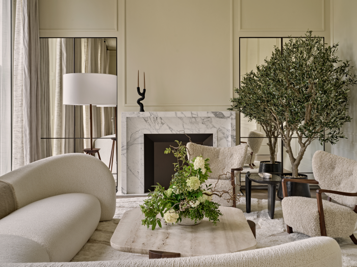
You’ve used a soft tonal palette for the apartment, including in this formal living room. Can you talk a little about why it was selected?
The soft tonal palette was chosen to evoke a sense of calm and understated luxury. Given the clients’ desire for a serene environment, we selected a range of neutrals from Argile that work together harmoniously to create a soothing backdrop. The challenge was ensuring that these tones did not feel flat or monotonous, so we introduced texture and micro-patterns throughout, adding depth and interest. This palette also allows historic architectural details and carefully curated furniture pieces to shine, resulting in a space that feels both sophisticated and welcoming.
The wall finish in this space is beautiful. How was it achieved and why did you choose it?
The wall finish was achieved through a meticulous application of soft plaster, which we chose for its tactile quality and subtle depth. The textural finish enhances the serenity of the space, providing a warm, inviting backdrop that complements the apartment’s classical architecture.
The apartment has an appealing palette of materials. What did you choose for this cooking and dining space and why?
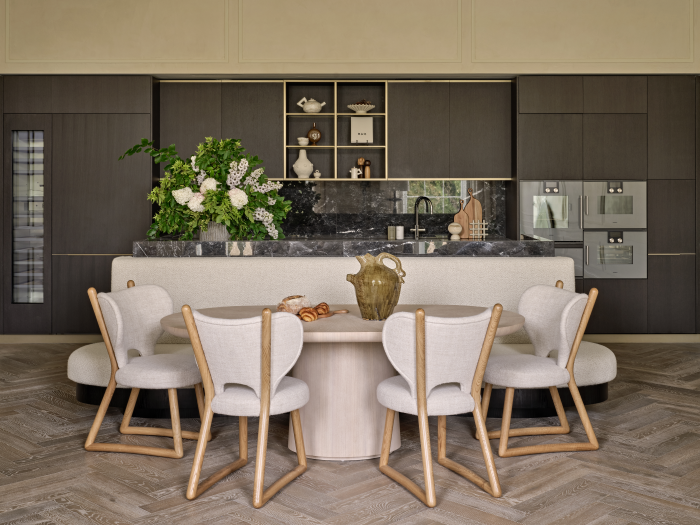
For the cooking and dining space, we carefully selected materials that combine both functionality and aesthetic appeal. We used a mix of natural materials, including timber and metal, to create a sense of warmth and durability. The joinery, crafted by Bill Cleyndert & Co, features rich wood tones that bring a natural elegance to the space, while metal accents add a contemporary touch. The palette is restrained yet luxurious, ensuring the space feels cohesive with the rest of the apartment.
The snug continues the appealing curves of the apartment. Could you talk about its lines?
The curves in the snug are a continuation of the apartment’s overall design language, which places emphasis on nature through fluidity and harmony. We chose to incorporate soft, organic lines to create a space that feels intimate and cocooning. The curved forms are not only visually pleasing but also enhance flow, making the snug feel connected to the formal living and dining space beyond. These lines also resonate with the classical architecture of the building, offering a contemporary echo of period design. The snug, with its inviting curves, is designed to be a cosy retreat within the home, offering both comfort and tranquillity.
Two of the bedrooms of the apartment have been transformed into work spaces. Can you tell us a little about the designs for those?
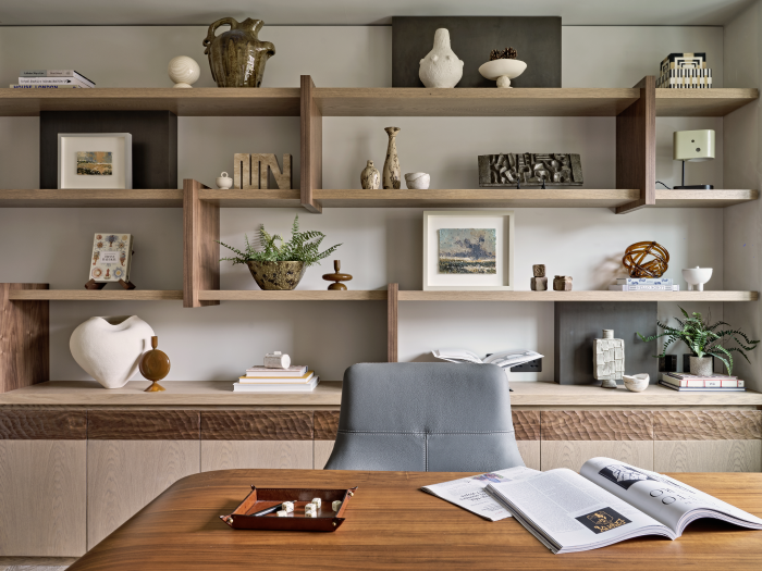
The transformation of the two bedrooms into work spaces was driven by the clients’ need for functional yet elegant study areas. We approached these spaces with the same attention to detail as the rest of the apartment to ensure that they are both practical and aesthetically pleasing. The design incorporates bespoke joinery by Bill Cleyndert & Co, providing ample storage and work space whilst maintaining the refined aesthetic of the wider home. Soft, neutral tones and tactile materials were used to create a calming environment conducive to focus and productivity. The spaces were designed to feel like a seamless extension of the main living areas, offering a serene and sophisticated atmosphere for work.
The apartment’s lighting is striking. What prompted your choices for it?
Lighting was a crucial element in creating the right ambience throughout the apartment. We wanted the lighting to illuminate the spaces, and to enhance the architectural features and overall mood. In the corridor, for example, we introduced a light in the archway that creates a soft, glowing effect, emphasising the curved form that echoes the arched windows of the formal living space. This approach to lighting helps to set the tone for each room, whether it’s through subtle task lighting in the study areas or statement pieces in the living spaces. Our goal was to ensure that the lighting fully complemented the design by adding an additional layer of warmth and sophistication to the apartment.
Take a look at our designer Q&As with Chloe Bullock, Susie Rumbold, Sophie Ashby, Sue Timney, Staffan Tollgård, Jenny Weiss and Helen Bygraves, Kelly Hoppen, Shalini Misra, Katharine Pooley, Brian Woulfe, and Christopher Dezille.
Cover Image by Jake Curtis, group photo by Nick Rochowski, project imagery by Nick Smith
Explore new resources from the BIID. Seeing a padlock? Just login or become a member to view.
Angela Bardino reflects on a landmark year for the BIID
The BIID Student Drawing Competition has now launched for 2025
Celebrate 60 years of the BIID with Past Presidents Gordon Lindsay and Christopher Vane Percy
Explore new resources from the BIID. Seeing a padlock? Just login or become a member to view.
Due by Wednesday 30th April 2025 for all learning activities undertaken in period 1st April 2024 to 31st March 2025.


